(TL;DR= pocket notebooks: knockdown, drag-out showdown, with lots of pictures, numerical scores, and opinions.)
So, in my quest to be more, well, lots of things, I vowed long ago to carry a notebook with me as often as possible. The things I wanted to "be more of" include, but are not limited to: more mindful (and hopefully less forgetful), more consistent in the writing of various things (journaling, common-place bits, tasks, etc), and ideally more creative through jotting down bits of inspiration, ideas, story elements and what have you. Great. Notebook on-hand at (almost) all times. Now what?
If you spend any amount of time in the hip think-space of analog writing, you will inevitably come across the "pocket notebook". Particularly if you want to carry it around all the time, right? Hah. Anyway, this refers not just to a notebook that is pocketable in size, but in the more current usage it refers to a notebook of a somewhat specific size and make. I don't want to spend a great deal on this, because if you happen to be reading this, you likely are already aware. So, as far as I'm concerned, we'll just say: the first is the hardbound, Moleskine-style little black book- hard cover, pocket in the back, bookmark, and elastic closure strap. Great. The second is the thinner, softbound style, often sold in packs of three. They are commonly referred to as "cahier" or "utility books". By and large, both sorts of these "pocket notebooks" are 3.5" x 5.5", give or take a millimeter or 1/32" or two.
I have for the most part sworn off the first of these types. I've gravitated to the utility book style for a couple of chief reasons. First is- they're shorter. The typical hardbound pocket notebook is 192 pages. It's not a monumental task to fill one up, and I have my share of them. But what I have run into is durability problems. Even if I go through a period of manic insomnia and fill one in a few days or couple of weeks, I just beat stuff up too badly. The recent Moleskines and Piccadillys I've had suffer binding and cover issues after I molest them. With the utility style being thinner, I fill them much more quickly, they see less road time and so tend to last better. This dovetails into the second reason I have moved to these- the Traveler's Notebook idea. I can keep two or three books with me, have a very durable cover, and swap them out as needed. I also get the added superstitious nerd benefit of it always being "my notebook", with the characteristic marks of use, regardless of the contents. I also get more frequent moments of "yeah man, filled another one!". Further... (shut up and pictures already!) it allows me to keep a couple of different books for specific things- journaling/common-placing, tasks, dedicated story notes, etc.
SOooo, that then leads us to... WHICH ONE do I buy? If you write often enough, you start to fill them up, and you have to buy more of them. So which one shakes out as the best value? There are now many competitors in this space, and they are all good in certain ways, and all relatively comparable in price, size, and features.
So you end up, like me. scraping around the web for reviews, good pricing, whether or not it's good for fountain pens or certain media, etc., etc., etc.
Then you end up, like me, with a bunch of pocket size notebooks of varying degrees in a stack on your desk.
That's when you pit them into a match all against every other, to the death, cage not opening until there is only one left. Or maybe two, but stubbornly standing on opposite sides of the cage, refusing to approach each other.
So here we are.
The contenders:
Moleskine Cahier
- 3-pack
- 192 total pages per pack / 64 pages each
- $8.95 per pack
- 2-pack
- 136 total pages per pack / 68 pages each
- $1.98 (close-out price, if you can find them. They are discontinued.)
- single notebook
- 144 pages each
- $4.99
- single, or 3-pack
- 144 pages each
- $5.95 each, 3-pack for $9.98
- 3-pack (or in 6-packs now)
- 144 total pages per pack / 48 pages each
- $9.99 (6-packs are $20.00)
- (Now, I have to take a moment to let you know- the group photo contains the "PeeWee" Banditapple. The writing tests are done in a "Handy" edition. It is slightly larger, but same construction and paper. This is because between taking this group photo and actually getting around to finishing all the writing samples, I had filled the two PeeWees already..... sorry.)
- single
- 64 pages each (192 pages if you get three)
- $3.50 (which becomes $10.50 to make a 3-pack)
- 3-pack
- 144 total pages per pack / 48 pages each
- $9.95
- 3-pack (also comes in a boxed 12-pack for 24.95; kinda cool)
- 96 total pages / 32 pages each
- $8.95
- 3-pack
- 144 total pages per pack / 48 pages each
- $12 to $14, depending on cover style

WAIT.
Suddenly, a new contender approaches the cage.
Updated group shot, including the Furrow Books Founding Supporter single edition (numbered #407 incidentally):
Furrow Books Pocket-Size
- 3-pack (normal editions)
- 144 total pages per pack / 48 pages each
- $9.99 (normal editions)
- (in this pic, it's between the Doane and black Miro)
(This pic also displays the afore mentioned and infamous Banditapple swap- the big green thing on the left there.)

Here we have a stack comparison, just to highlight the differences in edge, thickness, etc.


Alright, so who wins?
It was an arduous battle.
Now, I pretended that I wanted to be as completely unbiased as possible during this comparison, so I fabricated 12 categories with which to grade each contender. Things that sounded like things that people who care about notebooks might care about. Later on, I was made to admit that this was probably a bad decision. Anyway, the categories are:
- Show-through / ghosting (the visibility of a written stroke on the back of the page)
- Bleed-through (ink actually soaking through to the surface of the back of the page)
- Relief (the tactility of the back of a written page)
- Spread (the tendency of an ink line to expand after soaking in)
- Feathering (the tendency of ink to spread into individual fibers, giving a "feathered" edge to a line)
- Tooth (the "grit" or texture of a page)
- Smoothness (very closely related to tooth, but some toothy papers can still be smooth, and some smooth, gliding papers can actually have some tooth. Splitting hairs, I know, but like I said, I'm making this up as I go.)
- Color (basically, whether or not I liked the color of their paper)
- Pattern (my completely reasonable opinion on the efficacy and utility of the printed patter on the page)
- Layout (binding, pattern, and dimensions, and how they affect lay-open, whether it could be turned sideways effectively, etc.)
- Build (binding method, materials, execution)
- Cover (whether I liked it, good thickness, etc. Probably didn't need to be separate from Build, but it allowed me to score the aesthetics of the cover too, so deal with it.)
Each of these categories was scored from 1 (dismal failure) to 10 (starlight shining in your heart), for a possible perfect score of 120. I took anywhere from 5 to 12 pictures of each, depending on my whim and impression of the book's overall feel. Again, this is not science. This is pretend, Internet science.
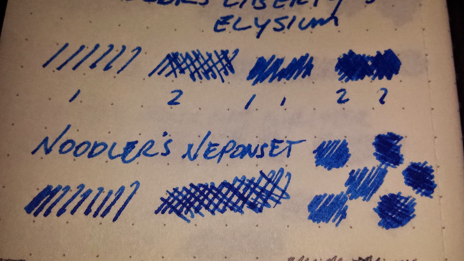
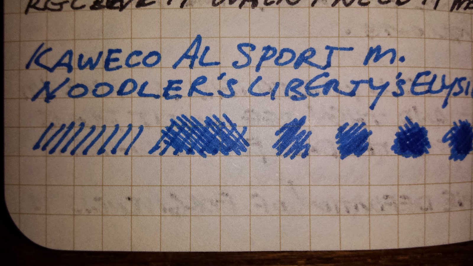
The ammunition was thus:

- Nemosine Singularity Medium with Noodler's Liberty's Elysium (and in many cases, a Kaweco AL Sport Medium taking the pen slot here, same ink. Very occasionally a Noodler's Neponset thrown in for kicks, same ink. I really love this ink.)
- Zebra ballpoint
- Uniball Vision Micro, black
- Pilot Precise Grip Bold, black
- TÚL Rollerball Bold, black
- Uniball Vision Fine, black (yeah, this guy's not in the pic. WTF, on a smoke break or what?)
- Uniball Vision Elite Medium, Red
- Pentel Sign Pen
- Sharpie Fine
- Pentel Rolling Writer
- Pilot Varsity fountain pen
- Uniball Signo Impact 207
- Chart-PAK design rendering marker (A.K.A., the paper slaughterer)
- Sanford Col-Erase sketch pencil
- Dixon Ticonderoga #2 HB
- Papermates Naturals #2 HB
- Pilot Metropolitan Medium with Pilot blue cartridges
All right. That's a lot of ground to cover.
First in the ring:
Moleskine Cahier
The veteran warrior. I got my first set of Cahiers in college ten years ago. (What. Ten years ago? Ugh.)
Now for some pictures. Finally.


Woo. The Moleskine, quite honestly, scored far better than I was anticipating. I had not purchased any in a while due to lackluster performance with fountain pens, but this time around, "trying to be unbiased", the one I tested came out rather ok.
- show-through: 3 (many visible from the sample pool)
- bleedthrough: 3 (also many culprits in this category)
- relief: 4 (could sense many of the lines)
- spread: 7 (surprisingly, not much spread, which was nice)
- feathering: 6 (better than I was expecting...)
- tooth: 7 (somehow, their paper feels really good, for all its faults)
- smoothness: 8 (see tooth...)
- color: 9 (I still love their shade. Sue me.)
- pattern: 10 (It's a perfect line-weight on the shade of the paper in order to be usable but not in the way)
- layout: 10 (This they really get right. The thickness of the paper combined with the stitching and cover make it usable in many positions and orientations)
- build: 9 (all things considered, quite decent here)
- cover: 8 (quite plain, which is good, and with a pocket. woo)
Miro Utility Series
I came across these in a random bout of Internet notebook mania. I think I first heard of them via reddit.com/r/notebooks, but I am not certain. Anyway, I picked up a pack. The Miro differs from the norm in a few ways: they are slightly narrower at 3.25", they come in 2-packs, and they are out of print. You may be lucky enough to find a vendor that carries them, but I am not going to share this information. I like them too much, I am selfish, and you have to find that vendor the same way I did. Hah. I am very impressed with the quality of these books. It's hard to see in the one shot of the edge, but the cut edge is exceedingly smooth and even, especially compared to some of the others in this bunch.


The Miro scored quite well, even though it got a really disappointing Show-through score:
- show-through: 2 (disappointing, really, but...)
- bleedthrough: 7 (bleed-through was mostly absent; really good here)
- relief: 4 (eh, not the best, not the worst)
- spread: 9 (fantastic pen handling here)
- feathering: 7 (except for a slight dip here)
- tooth: 10 (something in this paper just feels SO right- good for pen or pencil)
- smoothness: 7 (not too much resistance, but not the glassiest thing ever)
- color: 10 (a really lovely shade of cream here)
- pattern: 7 (dot-grids are awesome, but they are ever so slightly too faint here)
- layout: 9 (I am honestly not a fan of the 3.25" width)
- build: 10 (fantastic stitching in a nice blue contrasting thread, perfectly smooth edges all round, nice embossed logo)
- cover:8 (par for the course; no pocket though)
A really solid all-around contender. Everyone else should be scared, but as the Miro is sadly out of print, its time at the top will be brief at best.
Wilson-Jones Line Memo Book, Dollar and Cents Format
I picked one of these up on a whim after seeing a short comment about them somewhere in the recesses of the notebook wormhole on the 'net. Eh. It measures 6.5" x 4", in-between the Utility Book size and the full size Traveler's Notebook or Banditapple Handy, and sports a ledger-style line pattern.


This notebook did not score that well overall, with the exception of a couple of categories.
- show-through: 1 (scoring lower than the Miro here, and not making up for it)
- bleed-through: 3 (double as a Kleenex in a pinch? Maybe not, but not far off)
- relief: 2 (even some of the wetter pens with really light pressure could be felt on the back of the pages)
- spread: 5 (not that bad here...)
- feathering: 2 (but that bad here)
- tooth: 6 (decent feeling...)
- smoothness: 5 (run of the mill... get it...? paper...)
- color: 8 (really pure, bright white here, which is nice if you want it)
- pattern: 5 (it would really server the stated purpose, but as a pocket journal, it's obviously a bit intrusive. Particularly if you'd want to turn the book to write.)
- layout: 6 (too big to be truly pocketable, but the stitching, binding and flex make for a decent lay open or turned orientation.)
- build: 9 (edge finishing was not up to the group leading Miro, but the cloth tape over the fully stitched spine is a nice touch. Shame this is wasted on such flimsy paper.)
- cover: 6 (no pocket; slightly thin side of the group)
Military Memorandum
So this book, in the form that I obtained from Amazon, is basically a rip-off of mil-spec pocket notebooks that were handed out to service-people for on-duty notational needs. Many people in the reviews rave both about the originals and these copies, but there are some naysayers as well. I am in the latter camp.


Uncle Sam's distant nephew did not fair well on our training course. Gunny would be disappointed.
- show-through: 1 (read front or back! woo!)
- bleed-through: 4 (not as terrible as expected, but not good either)
- relief: 1 (Daredevil could read this with his toes)
- spread: 8 (What? Surprise category performance here)
- feathering: 7 (and here, too. Wow)
- tooth: 6 (ok, is the platoon coming back strong?)
- smoothness: 6 (ok, chalking up some decent showings here)
- color: 7 (a nice strong white with a strong blue line. If lined is your thing, these are ok)
- pattern: 6 (but... the line is honestly a touch too bold, and lined paper is obviously kinda wonky if you try to write in any other orientation)
- layout: 3 (the perfect-bound style is crap for lay-open, and makes for a tough time turning the book to write, or holding open to get a full line in)
- build: 2 (really not that good... the glue is suspect, the paper is mostly crap, and the back sheet as you can see was torn out)
- cover: 2 (flimsy, with hokey logo)
Doane Paper Utility Books
I will admit up front here- I have some issues with these, which you'll see in the tests and scores. But even so, I cannot help but love these books. There are a couple of factors here. Chad Doane has made a fascinating and aesthetically near-perfect company and product lineup. His tumblr feed is fan-freaking-tastic. His product design partnerships (bags, clothes, etc) are spot-on, making for some really drool-worthy gear. The Utility Books naturally sport the signature Doane feature: Grid+Lines. I have seen some folks criticize this pattern for having too-small squares and too-far-apart lines. I fall in the middle- the grids work for me, and I can use them for writing guidelines as well. My handwriting can fit single-space if I have a fine enough pen and want to make it fit. However, when I use the bold horizontal lines as intended for regular writing, I do find them a bit too far apart. Nevertheless, I love the visual appeal of a page of Doane paper, and again, Mr. Doane's visual presentation is hard to beat.


- show-through: 2 (one of the issues I mentioned above)
- bleed-through: 4 (not terrible here, but not great either)
- relief: 5 (respectable)
- spread: 4 (another one of my issues noted earlier. I would like to see a notebook this cool perform a tad better with many pens)
- feathering: 6 (despite more spread than I would like, it does well enough here)
- tooth: 7 (really good feel though...)
- smoothness: 6 (but not as "fast"...)
- color: 9 (again, I really like what they're doing)
- pattern: 9 (need I say more?)
- layout: 10
- build: 9
- cover: 9
Banditapple Carnet Peewee
I found these books through their awesome free sample promotion. From their headquarters in South Korea, they will send a free sample for the cost of shipping to anywhere in the world. I got one, and have been hooked ever since. I've filled up three or four PeeWee size books since that first order. They are wonderfully simple yet very well made, and boast far and away the best paper for fountain pens out of any of the books here. (Remember though that the writing tests shown are in a Handy size, not a PeeWee.)


- show-through: 8 (almost none, but some of the heavier lines peaked through)
- bleed-through: 10 (the only bleed I got was the massacre of the Chart-PAK marker)
- relief: 8 (really going at it can make a line be felt, but it's not easy)
- spread: 9 (a really wet combo in a fountain pen can get some spread, but none on average)
- feathering: 10 (almost completely absent)
- tooth: 9 (really good feel for me, though I have seen some folks say there is a tad more resistance than they would like)
- smoothness: 8 (same here)
- color: 9 (I really like the subtle greyness to the white, and the grid is a good balance of bold yet out of the way)
- pattern: 9 (sometimes, I feel the grid could be a tad more faint, but that feeling usually passes)
- layout: 10 (executed all the marks of this form factor perfectly)
- build: 10 (can't be more pleased)
- cover: 7 (excellent card stock, good texture, but a pocket would be nice I guess)
Field Notes
These are the quintessential "it's not a Moleskine, and you wish you were this cool" notebook. They have a really great thing going with the Colors editions, and I really appreciate their practice of printing at various U.S. based print houses. They, like Doane Paper, have a really strong design sense, and their marketing is honestly top-notch. Sadly, the paper tends to leave a lot to be desired. Also, because I am awful, I did not purchase a new pack of these for the review, and you'll have to make due with some pics from a filled sample. Sorry.


- show-through: 2 (this is a common complaint for Field Notes)
- bleed-through: 2 (as is this)
- relief: 8 (surprisingly little here though)
- spread: 3 (a wet pen will soak in fast and be bolder than you intend)
- feathering: 5 (not too terrible here though)
- tooth: 6 (but a good feel here, and does well with pencils. I suppose that's good, since they also sell pencils.)
- smoothness: 7 (an overall nice feel though)
- color: 9 (a great shade of off-white, and the color of the grid in the standard kraft edition is perfect)
- pattern: 9
- layout: 8 (I would prefer a stitched binding, as I find it gives a more consistent lay-open when turning a book)
- build: 7 (staples take a couple knocks off here, but overall, they are well done for what they are. Though, the edges could be cleaner here)
- cover: 7 (ditto)
Scout Books
I had not heard of these until I finally decided to do a "shoot-out", and went looking for any stragglers that I might be able to get. I found them on Amazon one day just hanging out in the stationery section waiting for someone to pick them up, so I gave them a go. All told, I think they're on the right path but in the final tally I was a bit underwhelmed. They do have some stand out characteristics, both good and bad. They come in three packs with various page patterns, but they also have a 12 volume box available. This is actually a really cool idea. They are also dimensionally a drop-in replacement for Midori Passport size refills. However, where most books in this group sport 48 or 64 pages, the Scout has only 32, and for a similar cost. Combined with the lost vertical half-inch, you're losing significant cents-per-page value here.


Here you see the 5" vs 5.5" form factors.

Note the Scout Book a touch wider than Field Notes here.


- show-through: 4 (not awful, but could be better, especially for their cost-per-page)
- bleedthrough: 7 (good showing here though, because the paper is actually thicker)
- relief: 7 (also here)
- spread: 7 (doing well so far)
- feathering: 5 (but... a little too absorbent in this area)
- tooth: 5 ( felt a bit rough, really)
- smoothness: 4 (yeah, that...)
- color: 8 (a good white, and I dig the grey of the printed pattern)
- pattern: 4 (they have a good idea going but the margins, while meant for a title or other heading data, miss the mark. This function could easily be drawn in over the grid here (which is not too bold) if needed, and then you wouldn't lose the grid on pages where you don't need the header)
- layout: 7 (decent, but loses a couple marks for the grid issues)
- build: 6 (only two staples, and they use a thicker card stock for the cover. This is nice at first, but it makes for a bit stiffer lay-open than most here)
- cover: 6 (I see the point if the much stiffer cover, but it's just a little too stiff I think. Also, two staples here kinda bums me out.)
Word.Notebooks
These are another player in the hip pocket notebook crowd. They bank on the novel Bullet Journal task list format. If that's inline with your methodology, then you may love these. I don't use that system, so the pattern is lost on me. But leaving that aside, the real disappointment for me with the Word books was the paper performance. There was a lot of feathering, spread, and show. Also, like Scout Books, they have a quite higher cost-per-page than the rest of this group.


- show-through: 2 (yep)
- bleed-through: 3 (much more than I would expect for the cost of these books)
- relief: 4 (not great...)
- spread: 2 (any moderately wet-ish pen will have spread)
- feathering: 4 (definitely noticeable in many cases)
- tooth: 6 (but a good feel here, and works well with pencils)
- smoothness: 7 (despite the other issues, a good feel here)
- color: 8 (a good white, and the line color is quite nice)
- pattern: 3 (again, I don't use their targeted system, so this is lost on me)
- layout: 4 (see previous point, as well as the two-staple problem)
- build: 6 (two staples, inconsistently finished edges, and I had two books from the same pack exhibit varying degrees of the aforementioned paper performance maladies.)
- cover: 7 (some neat notes on the inside, a good logo, good card stock, but again, that two-staple thing)
Furrow Books Pocket-Size
These are from a lovely startup out of Nebraska, and I was lucky enough to snag a founding supporter copy. The gimmick here is blank pages with an insert that you place behind the current one in order to gain either a lined or a grid layout. (I don't say 'gimmick' in a negative way though- it works.) I do like the functionality of having any of three orientations- lined, grid, blank- available in the same book, and that without having them predefined as to where they would be.


- show-through: 3 (though, let's be real- you can't really fault them for a bit of show through when part of the point is that you can see lines from a paper under your current page...)
- bleed-through: 5 (though there is that show-through, bleed was not that bad)
- relief: 5 (decent here)
- spread: 8 (really consistent and not too shabby here)
- feathering: 7 (pretty good, but a bit cropped up in places)
- tooth: 8 (really good feel here)
- smoothness: 8 (quite nice)
- color: 10 (great white, but with some of those "quality paper flecks" thrown in; very nice)
- pattern: 10 (I find the system really functional and had no problems using the card)
- layout: 10 (well done, here. I am pleased with how this idea turned out)
- build: 8 (my sample's center staple was a couple mm's off, but from what I understand, this was an issue in the first run of prints that is supposed to be resolved in later batches.
- cover: 8 (good stock, cool colors. I hope they come out with further themes in addition to the two they currently have)
All right. Whew. That was a long slog of hand-writing, picture-taking, and uploading madness.
And the WINNER IS...
And now for some hinky math, and my mildly arbitrary "Final Value Score".
The way I worked this out was:
Final score out of 120, converted into a percentage. Take that, divided by the cost per page, and this gives a positive integer. This number, the higher the better, is the Final Value Score, or value per page, based on the testing criteria and respective scores.
| Book | Score | Cost per Page | Final Value Score |
|---|---|---|---|
| Moleskine Cahier | 84 = 70% | 4.6c | 15.2 |
| Miro Utility Series | 90 = 75% | 1.4c | 53 |
| Wilson Jones | 64 = 53% | 3.4c | 15.5 |
| Military Memorandum | 53 = 44% | 3.6c | 12.2 |
| Doane Paper Utility Book | 80 = 67% | 6.9c | 9.7 |
| Banditapple Carnet | 107 = 89% | 5.4c | 16.4 |
| Field Notes | 73 = 61% | 6.9c | 8.8 |
| Scout Books | 70 = 58% | 9.3c | 6.2 |
| Word.Notebooks | 56 = 46% | 8.3c - 9.7c | 5.5 - 4.7 |
| Furrow Books Pocket-Size | 90 = 75% | 6.9c | 10.8 |
Let's note a couple of things:
- The ridiculous score of the Miro is due to two things- it performed really well, and the purchase price I got it for.
- The higher scores of the Military Memo and the Wilson Jones are due mostly to their low costs. The cost savings here are not to me worth the hit you take on the paper in these books.
At the top end, we have the Banditapple. As I've mentioned, the product you get for the price you pay is nearly incomparable. It really is that good.
Then we have Moleskine, Furrow, and Doane bringing in the higher end of the rest of the field. Each of these has clear benefits and drawbacks.
And bringing up the rear of what I would call "real contenders", we have Field Notes, Scout Books, and Word.Notebooks. As far as raw performance goes, these guys were soundly beaten by the other players, on many levels.
So there we have it folks. If you found this at all helpful or even mildly interesting, let me know so that I don't loathe my own existence for having spent so much time on these notebooks.
Woo.
Post Script:
There are some additional examples of the 3.5" x 5.5" stapled/stitched notebook that I do want to eventually test, but have not yet for various reasons:
Callepino. Reason: I am a cheap bastard and don't want to pay the cost of the books and shipping to get them. However, everything I've seen about them, they appear to be fantastic.
Rite in the Rain. Reason: They are a niche product, and I don't typically have a use case for the specialized paper. That said, they typically have really good reviews. If you need the durability, this is your man.
Clairefontaine. Reason: See previous note about being a cheap bastard. Also, I promised myself and my wife that I would not buy any more notebooks until all my currently owned ones are filled..........
Rhodia. Reason: See Clairefontaine.
White Lines. Reason: dammit, I really want to get these..... ugh.
What an amazingly comprehensive comparison! I've been actively seeking out pocket notebook reviews lately so this was extremely useful for me. I'm going to check out both Furrow and Banditapple, neither of which was even on my radar before reading this.
ReplyDeleteOne more to add to your "review someday" list: EcoQua, which is pretty readily available at Amazon and elsewhere. I haven't tried them yet but they're on my list.
Thanks! I'm glad you found it useful. Eventually I plan to get the ones I mentioned and run them through the wringer. I will definitely add the EcoQua. They look really good as well. Thanks again.
DeleteAnd I thought I loved notebooks :D Great review! And yes, we should fill our notebooks before getting new ones :)
ReplyDeleteThanks! It's so hard to practice restraint though, isn't it?
Delete